Hone Smart Home
At the end of my last entry I outlined my discovery that there was an app building company called Bubble, which would likely lead to brand confusion. As a result I decided to go back to some of the ideas on my earlier sketchbook page and consider other possibilities that would tackle some of the same goals. The following company traits need to be suggested by the name:
- Organisation, finesse, attention to detail
- Protection and/or care
- Attentiveness
- A connection to housing and or containment
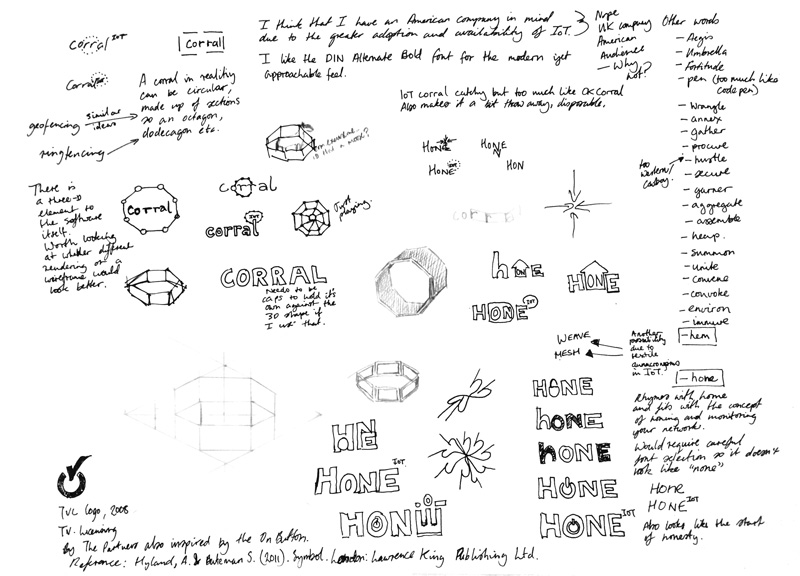
Initially I came up with “Corral”, especially as I thought that this would appeal to the Smart Home market in the United States which seems to be more fully developed than that of Europe (I have sought data to prove this but a lot of the market research is behind pay walls, I did however find a nice snippet from Statista included below).
 You will find more statistics at Statista
“Corral” suggests containment, gathering and shepherding something that is perhaps unruly. There could also be a potentially useful or possibly tacky mnemonic in that “IoT Corral” would remind users of “O.K. Corral” (O.K. Corral (building), n.d.) , another US connection. However, I decided this would likely err on the tacky-side. “Corral” is quite a specific idea so I tried out some new logo ideas and also had a think about rocking the minimalist boat by creating a more three-dimensional logo.
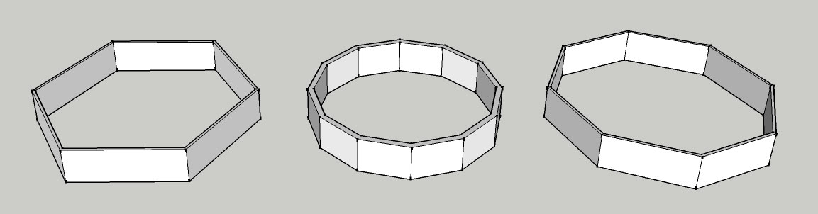
Shapes which could suggest a corral - essentially an abstracted animal pen.
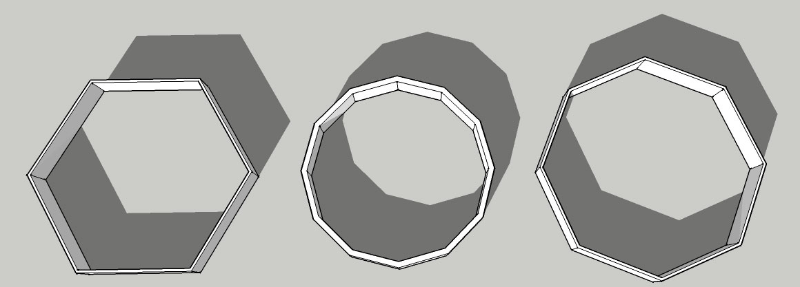
Shapes with the shadow casting turned on. This allowed me to think about how these images would look if they were simplified into 2D shaded areas to provide the illusion of depth and perspective.
I created these images in Sketchup (Trimble, 2017), a piece of software which I will undoubtedly use for some of the graphic prototyping in the app. I have a background in 3D modelling and the smart home visualisations will be more effective if they are
modelled architecturally.
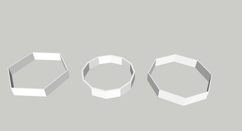
In this version I omitted the lines in order to see how pue shading would look.
![]()
I was thinking of something like this logo but with a top and bottom section and more shading placed over logo text or on the left of the logo image (Stankowski & Duschek, 1992 as in Hyland & Bateman, 2011, p. 266).
The “Corral” concept although an equilateral has some similarities to a circle or oval and could suggest protective and nurturing qualities as we learned from the initial lecture with Phil Jackson. It could also be seen to bear representational similarity to an eye depending upon the placement of the logo title text. “Corral” wasn’t quite working for me, it felt too fortified and possible too specific to the United States, it also started to remind me of a bank or credit card and there needs to be something more personal and homely about this product. Once again I changed tact.
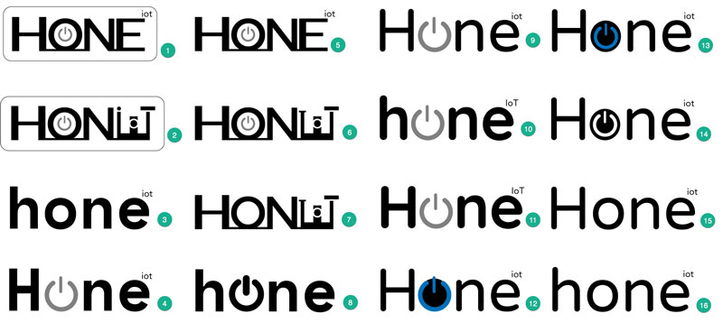
The next idea that I pursued was to develop the word “Hone” as the company or app name. I immediately had a better gut feeling about this word especially when combined with my “IoT” trademark-style embellishment. On the surface level there is a nice mnemonic in that the word rhymes with “Home” and upon searching there aren’t any competing products with the same name. “Hone” is a verb which when used with no object is often confused with the concept of homing in on something as opposed to sharpening, perfecting or focusing which is the correct meaning; another “home” association, even though it is incorrect it is actually of benefit (Hone in vs. hone in, 2015). The only consideration with the word itself is that if viewed from a distance in a font without a high ascender on the “h” it could be read as “none”; this may mean that a capital letter at the start of the word is preferable. With this in-mind I started with the typefaces I had explore of what I had first in the Adobe Creative Suite (Adobe, 2017) and then took a look at some Google fonts (Google, 2017a). Initially I started with quite chunky fonts and felt that I would like to include a powerbutton in the design to indicate control rather than making the home connection explicit by using a symbol. This also felt like it would allow space for the company and app to expand to the commercial sector if the connection was more subtle.

Power or on button icon inspiration. Source: www.psdgraphics.com linked from source
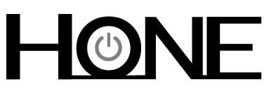
The first electronic Hone logo mock-up using the Montserrat Subrayada (Ulanovsky, n.d.) font and Prosto One (Lemonad & Emelyanov, n.d.) fonts.
This initial logo was too blocked and the plugged-in nature of the black lines, reminiscent of wires connecting each letter suggested an audio system or electronic music genre. I created a contact sheet of fonts based to keep for future reference and to trial in some logo designs: You can view this at the following link.
I tried out a few more ideas based on some hinting towards the futurism and vorticism art movements (see 2, 6 and 7), although these experiments proved to be overly busy and vaguely reminiscent of the cognitive dissonance I encountered the time I observed the design of the “It’s a small world” ride at Disneyland in CA, USA. Too much (in case you are wondering here is an image of the ride design).
I ran the logo contact sheet by a few people via social media, just for some initial thoughts and they gave me some good things to think about particularly the difference between European and US design tastes (an even split of EU and US comments). This also challenged some assumptions I had made about the better designs, so I will work up the best ideas in time for the session with Phil in order to get his feedback on the concept.
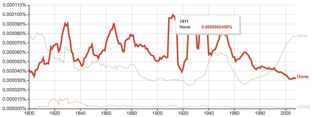
Direct link to this Ngram search.
As a final piece of research to confirm that “hone” was a solid choice of word for branding I looked at the Google Ngram viewer (Google, 2017b). The Ngram Viewer allows you to search Google books content from 1800 - 2008 based on boolean word queries. So I searched for “hone” and I was interested to find that the capitalised form of the word was at the peek of it’s popularity around 1910 right at the end of the Edwardian era. I have made comparisons between the current state of Internet of Things (IoT) to the disarray around that new fangled invention electricity in the Edwardian years before. For example, during the Edwardian period there were different current voltages for electrical supply in different areas of England surly a recipe for fire or electrocution; IoT has many different wireless frequencies and no common consensus on standards so it isn’t all that different (although accidental death is less likely). This Edwardian connection provided more design inspiration and made me think that deriving inspiration from Edwardian architectural etchings and engravings may look more modern than 3D models which look dated very quickly. For example, Hive which is British Gas’s Smart Home thermostat has a lovely simulation interface, but the home simulated with 3D graphics looked like an early 2000s computer game (it seems that British Gas might have realised this too and the demo is now harder to find on the site, but still seems accessible vai this link: https://www.hiveconnectedhome.com/. With this in mind I considered what a banner could look like for hone, the logo needs some tracking adjustments, but this was a first try with some basic layer blending and a clean finish.
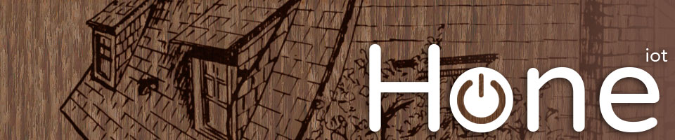
Phil also suggested that I look at some different wood finishes if I stick with this aesthetic. After coming back to this header test after a couple of days the current wood finish sort of reminds me of that cheap MDF coated board, so I definitely need to look at some alternatives. Something with more of a creamy background like this futurist drawing might be better.

By Antonio Sant'Elia - Utopie metropolitane, la mostra (in Italian). Style & Design. l'Espresso (2013-03-28). Retrieved on 2013-04-01., Public Domain, Link
References
Adobe. (2017). Adobe creative cloud [Computer software]. Retrieved from https://www.adobe.com/uk/creativecloud.html
Google. (2017a). Google fonts. Retrieved from the Google fonts website: https://fonts.google.com/
Google. (2017b). Google Ngram viewer. Retrieved from the Google Ngram Viewer website: https://books.google.com/ngrams
Home in vs. hone in. (2015) [Blog post]. Retrieved from http://blog.dictionary.com/hone-in-vs-home-in/
Hyland, A., & Bateman, S. (2011). Symbol. London, England: Lawrence King Publishing Ltd.
Lemonad, J., & Emelyanov, P. (n.d.). Prosto one. Retrieved from https://fonts.google.com/specimen/Prosto+One
O.K. Corral (building). (n.d.). In Wikipedia. Retrieved February, 18, 2017, from https://en.wikipedia.org/wiki/O.K._Corral_(building)
Trimble. (2017). SketchUp Make [Computer software]. Retrieved from http://www.sketchup.com/download?sketchup=make
Ulanovsky, J. (n.d.). Montserrat subrayada. Retrieved from https://fonts.google.com/specimen/Montserrat+Subrayada