Color scheme and beyond
This is a quick post to explain some steps that I took to explore colour after our final design session on Monday, 20th of February.
As a starting point and as a means to explore current trends in home design, I spent some time looking at the colour and visual decisions used in home magazines. This certainly provided some inspiration and I will expand on how I progressed on that below.
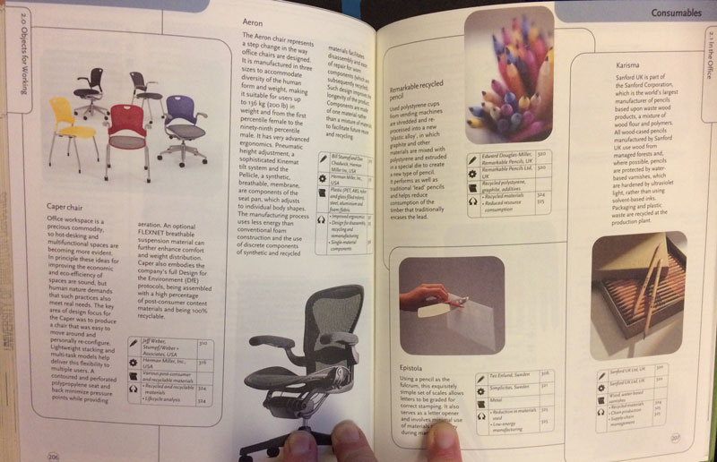
I also spent some time at the library looking at a selection of books on design, industrial design, data visualisation and architecture. I happened upon, “the eco-design handbook” (Fuad-Luke, 2004). The book is a collection of information about different products, who designed them and explains what makes the design eco-friendly. Although the content of the book is quite dated, I really enjoyed the simplicity of how information was laid out on each page. Particularly the structure and categories in the little boxes shown underneath each product. I feel that you can learn things about economy of space from print and some easily-digestible chunks of information like this might be helpful for codifying the attributes of black box1 (by concept, style and form) IoT devices.
Just keeping this here for future reference.
I also liked the colour scheme that the book designer used for the table of contents; there is a colour for each chapter and the colours are well-matched with complementary tones.
I took a quick photo of the pages and decided to include them in a collage using Adobe PS Express app (2017c) to try out different combinations. A sort of mini-moodboard,
although most of the more intense work took place in my sketchbook this time around.
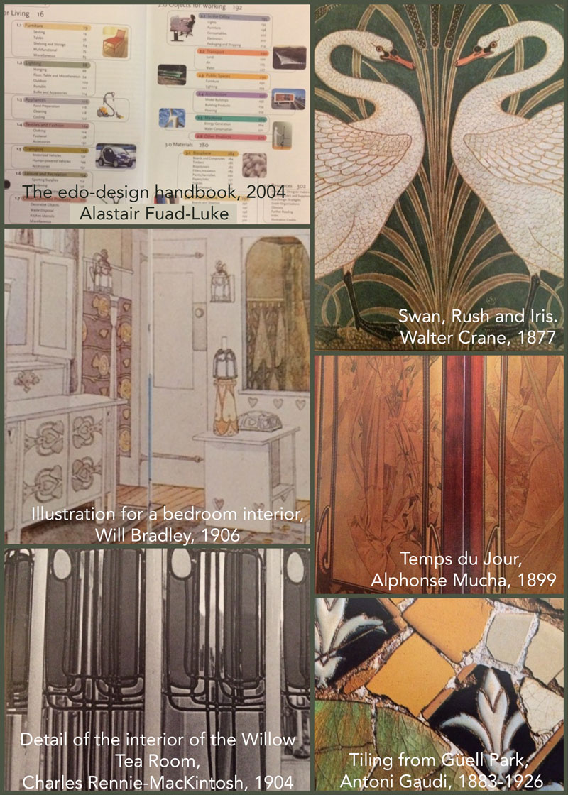
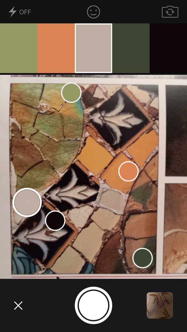
I would highlight the Gaudi tiles on the bottom-right as containing colours that contained the warm earthy tones that I was interested in.
Furthermore, there is a sort of antique olive green from the Victorian era (the Swan image) which, I keep coming back to. I cannot go too far in that
direction though as the colour choices could either end up looking too Victorian to Edwardian or like the 1970s Art Nouveau inspired graphics.
From the interior design magazines I found that the palettes used in the room mock-ups were quite analogous, as in all similar tones and textures. In one such mock-up the analogous colours were supplied by the tones of different blond woods and then a single tablecloth was included as an accent of colour. What I found interesting about the magazine is that there is a return to the decorative (for example embellished floral bedspreads), but nothing in the pictures was highly ornate.
In one of the bedroom images I found there was a painting on the wall which encapsulated some of the colours that I was interested in,
so I decided to make a drawing on my sketchbook page to explore the colours further. Mainly because the painting itself was very small and blurry in the
background of the photographic image. I could just about make out the colours so used some chalk pastels and then watercolour pencils to mix approximations of the hues.

I have attempted to zoom into the image of the photo in the image of my sketchbook page shown above, but it very blurred
What happened next was interesting as I didn’t really like the colours on the page, but I did like the colours on the nibs of the cotton buds that I was using to blend the pastels! So I decided to create my own version of Phil Jackson’s colour association activity in Adobe Photoshop (2017d), just to see how they went together.
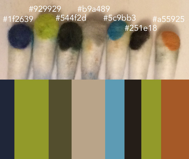
I quite liked the results and enjoyed the turqoise blue as a kind of accent colour. The dark blue however felt a bit too dark, but I decided to add my new colour scheme to the Adobe Color CC tool (2017b) and see what
I could do with it.
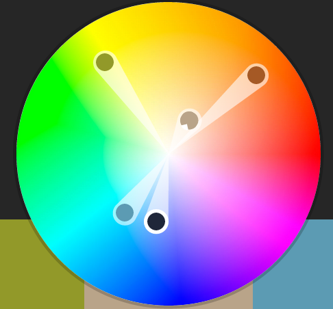
What I found was that my colour scheme was structurally a bit like a compound colour scheme except the lighter olive green was veering off in a different direction than the typical compound settings. I have to admit that
I am slightly confused about the use of the word ‘compound’ in this context as it just seems to indicate three analogous colours on one side of the colour wheel and two analogous and also complementary (to the first set of three) colours on the other side of the wheel.
Perhaps that is the point, but I have not come across that definition before when applied to this particular disribution of colours before. I took a look at other colour advice websites, but didn’t find any additional information about ‘compound’ combinations/distributions.
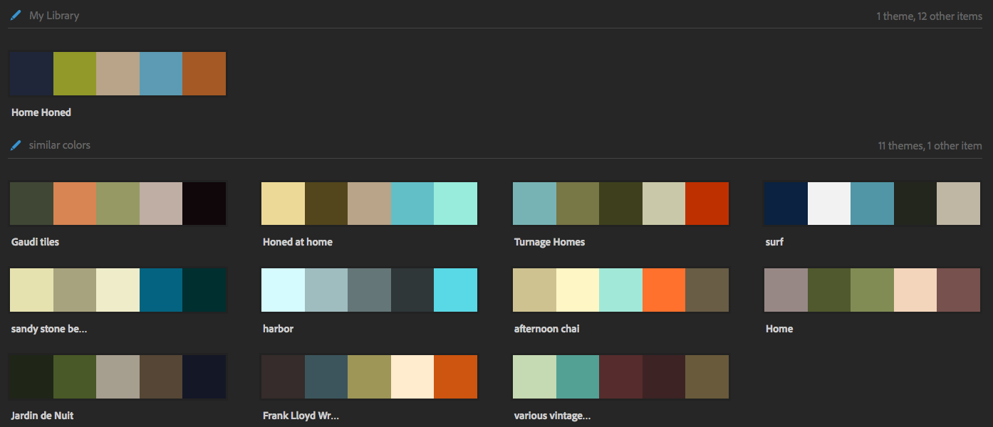
I found other colour schemes from Adobe color community, which were also tagged with the words ‘home’ and/or ‘sea’ (thinking Brighton-specific colours).
It was heartening to find that other folks had similar ideas. The “honed at home” color scheme shown in the image above is the compund version of my original colour scheme based on my cotton buds. I quite like it, but the beige brown seems less compelling and
genuinely homely than the terracotta colour.
As a result of all this, I also found a fantastic app which was available through my work Creative Cloud account, Adobe Capture CC (2017a)! It is absolutely fantastic for capturing textures and colours from images. I can tell that I am going to use it a lot for collecting ideas on the move. After doing the cotton bud colour matching using the dropper tool in the full version of Photoshop, I was slightly peeved at HOW easy it was to create the Gaudi colour scheme based on the image of the tiles in the app!
I will return to the colour schemes later in the project as I focus in on aspects of the service design, information architecture and user experience. However, my initial intention with this colour scheme until I am proven incorrect or correct through the research is to create something that runs counter to the overly metallic, de-humanised colours of the majority of Smart Home focused websites.
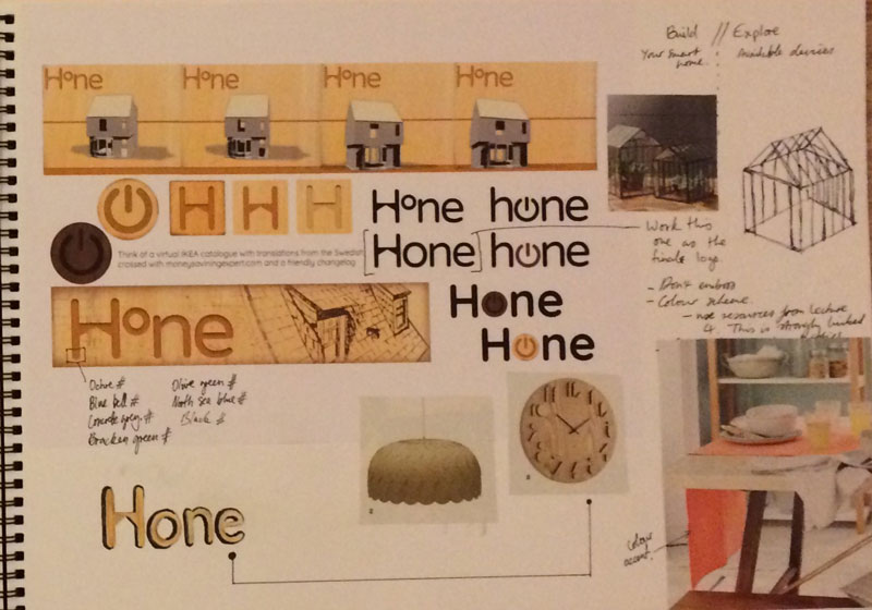
The profiled font, inspired by the wooden clock is something to try out in Sketchup and Photoshop later. It could offer a potential twist on minimalism with a bit of 3D perspective thrown in.
One of the best articles I read this week was about the use of metaphors in design. The article by Maggie Appleton for STRV Design (2015), cites examples of metaphor as an alternative to the mimicry of real objects (also known as skeumorphic design, a la Apple pre iOS 7).
I particularly enjoyed this quote:
"Referencing familiar elements of the physical world helps us understand the function, purpose and spatial relationships of our digital tools." (Appleton, 2015).
I will try to remember this to ensure that I am not seduced by the beauty of Art Noveau retro chic and keep the end user in mind. I also want to stand out from the pack through and for example in the iTunes app store, I observed that the app icons are now SO flat that anywhere that depth is used in an app icon, that app immediately becomes more exciting and eye catching. I suppose that when the world is flat one loses the perspective of a vantage point.
1 I had no idea that the term “black box” had such an interesting history in computer science terms, thanks Wikipedia for a primer (“Black box”, n.d.)!
References
Appleton. (2015, October 20). Why metaphors matter for app designers [Blog post]. Retrieved from https://medium.com/strv-design/why-metaphors-matter-for-app-designers-2fb477854f66#.mxy4jwwnc
Adobe. (2017a). Adobe Capture CC [Mobile application]. Retrieved from https://itunes.apple.com/gb/app/adobe-capture-cc-create-digital/id1040200189?mt=8
Adobe. (2017b). Adobe CC Color [Computer software]. Retrieved from https://color.adobe.com/create/color-wheel/
Adobe. (2017c). Adobe Photoshop Express [Mobile application]. Retrieved from https://itunes.apple.com/gb/app/adobe-photoshop-express/id331975235?mt=8
Adobe. (2017d). Adobe Photoshop Creative Cloud [Computer software]. Retrieved from https://www.adobe.com/uk/creativecloud.html
Black box. (n.d.). In Wikipedia. Retrieved March 1, 2017, from https://en.wikipedia.org/wiki/Black_box
Fuad-Luke, A. (2004). The Eco-design handbook. London, UK: Thames & Hudson.