Wireframes 2+
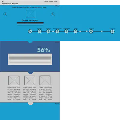
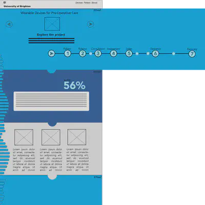
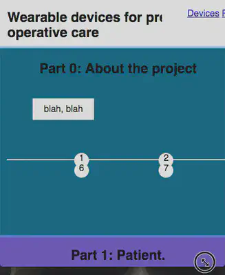
This post displays iterations of wireframe 2. In this wireframe, I took ideas from wireframes 0 and 1, but removed the next buttons in favour of a timeline at the top of the page. The top section of the page, containing the timeline, is shown as overflow (beyond the width) of the page to indicate the dynamic content. Clicking on the years, and circles on the timeline is intended to swap out the slide content and information in the centre of the timeline section. The arrow buttons on the left and right were also intended to switch between the content slides. These buttons ideally would also be operable via arrow keys on the keyboard. [caption id=“attachment_186” align=“alignnone” width=“840”]

Don’t get me started on how dreadful this looked when I looked at it on my phone. [caption id=“attachment_191” align=“alignnone” width=“230”]
Considering colour
Upon looking at a number of medical websites for journals, professional bodies and organisations including:
- NHS choices (blue/orange/green)
- Nursing and Midwifery Council (dark blue, aquamarine, pink and lavender purple)
- Royal College of Midwives (dark blue, two hues of light blue, white, purple and grey)
- Nursing Times (dark blue, aquamarine and white)
- Nursing Standard (scrubs green, two hues of dark blue, grey and orange for callouts)
- The Lancet (purple, blue, green - a lot of white space)
- Médecins Sans Frontieres (red and black
An outlier with the red and black theme, however this would underline the critical nature of the work they do providing aid in emergency situations. ) - The British Medical Journal (blue and white, orange callouts)
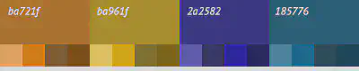
The colour schemes contain a lot of blue and this influenced me to look at some different colour combinations. I used the palletton colour selector web application (http://paletton.com/) to try a few bold colour combinations. I also tried it with some vision simulations (available on the bottom right) to see how the contrast behaved for different types of colour blindness. The swatches below show one of the better combinations I came up with, although it still needs work. [caption id=“attachment_190” align=“alignnone” width=“400”]
References
These are resources that I referred to beyond what I have linked to in the content above.
Border-radius. (2016, November 13). Retrieved November 27, 2016, from https://developer.mozilla.org/en-US/docs/Web/CSS/border-radius
Crockford, D. (2008). Functions. In JavaScript: The good parts: Working with the shallow grain of JavaScript(pp. 26–45). United States: O’Reilly Media, Inc, USA.
Titlow, J. P. (2014, February 20). About DuckDuckGo. Retrieved November 19, 2016, from https://duckduckgo.com/about
Fiona MacNeill
Learning Consultant &
UX Researcher
Passionate about creating inclusive and accessible experiences, tools, and services for learning and doing.