Images

Hone Smart Home
Hone Smart Home

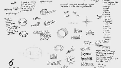
At the end of my last entry I outlined my discovery that there was an app building company called Bubble, which would likely lead to brand confusion. As a result I decided to go back to some of the ideas on my earlier sketchbook page and consider other possibilities that would tackle some of the same goals. The following company traits need to be suggested by the name:

13 Feb, 2017

Naming - initial ideas

On this page of my sketchbook I used a dice rolling exercise (Barnard & Briscoe, 2016) to explore different name combinations for the potential company. Initially I gravitated towards BubbleHome as a concept.

11 Feb, 2017

Welcome to my new IDM22 Journal

Greetings! I have decided that I would like to keep up my reflective writing activities during IDM22. This is due to my recent experience on the web development module and also thinking back to when I took IDM21 (seems so long ago now!). In both cases it was an immensely valuable venture.

4 Feb, 2017

The weekend of doom
The weekend of doom

\[caption id="attachment\_381" align="alignright" width="288"\]\[/caption\] Altering the Flickity Carousel/Timeline So changing the height of the Flickity carousel used for the patient timeline meant that the “dot” buttons had to be moved upwards otherwise they would be off the bottom of the visible area on most standard screen sizes. For reference, I have included a long screenshot that I made of the site prior to this work, on the right. So I decided that the dots should reside on-top of the carousel and then they would also be spatially connected to the navigation of the timeline. This is not really how Flickity carousels are really designed to exist (metafizzy, 2016), but it is closer to the original inspiration for my site the DuckDuckGo about page (DuckDuckGo, 2014). The main issue that I ran into was that the carousel needed to resize itself dynamically and I had media queries which hid the dots on mobile devices (as they were no longer very useful as buttons at that size). However, as the dots themselves are rendered automatically by the JavaScript, they were rendering much more quickly than the resizing. So I upon sizing-up a responsive browser window the dots and timeline appeared on top of everything and looked awful. I tried everything I could think of to fix this issue. I attempted to delay the dots in the JavaScript. I also tried writing a script which watched for the window size. I tried positioning the dots so that they moved upwards. I also tried creating condition code which watched for various conditions to be met prior to triggering the dots. Things I wrote worked to an extent, but not sufficiently or reliably enough to depend on them. In the end I had to temporarily hide the dots by setting them and the timeline to ‘display: none’. I also had to hide the spot where they generated by moving the about section upwards. Essentially the solution’s analogue equivalent is that the rabbit is being hidden in a compartment of the hat the whole time (oh wait…is that how they do it?). Performance Issues I am actually grateful that all of this happened as once I had cracked the rendering issue I realised that there were some major performance issues with the carousel/timeline. It took a bit of time to get to the bottom of it, but in the end I realised that it was the long svg that I had included to indicate the patient’s anxiety levels. Through testing in multiple browsers, on Mac, PC and mobile I realised that the image also wasn’t loading anywhere other than in Chrome for Mac. Everywhere it was just gumming up the works. I reassessed the need for the anxiety level gauge/image and decided that it was important to keep it. So through trial and error I ended up loading with an image tag in the html as a very, very long svg. This is the only svg in the site that I could not optimise as it resulted in optimisation errors because it was too long dimensions-wise. Also, I realised that I did not really want to optimise it as I would result in losing the drop shadow detail which I had added to a new version of the design.

16 Jan, 2017

Accessibility and responsive bits

This journal entry represents a mammoth effort to add high-quality content to the site. I developed and added the patient story. This was based on a characteristics list which I worked through rather vigorously on the afternoon of the 25th. This is still in handwritten form, so I will link to it as a google doc later on. I have included some key references for that process below. I want to highlight the National Joint Registry (2016) data, which was particularly helpful during the process of defining the patient story. Also the specific images that I used will be cited on the portfolio site (including cc0 works; royalty-free works) as I feel it is always very important to include the provenance of images in any context, but especially when engaging in a thought process based on a fictional patient/nurse interaction.

2 Jan, 2017