Part 1 of my final evaluation. This entry outlines key decisions that I made regarding accessibility towards the end of the development period. I am writing and publishing it retroactively as it as represents a very large amount of thinking and work, which I kept notes about as I went along.
19 Jan, 2017
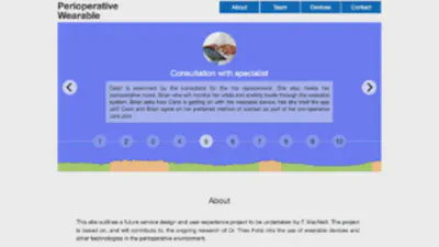
\[caption id="attachment\_381" align="alignright" width="288"\]\[/caption\] Altering the Flickity Carousel/Timeline So changing the height of the Flickity carousel used for the patient timeline meant that the “dot” buttons had to be moved upwards otherwise they would be off the bottom of the visible area on most standard screen sizes. For reference, I have included a long screenshot that I made of the site prior to this work, on the right. So I decided that the dots should reside on-top of the carousel and then they would also be spatially connected to the navigation of the timeline. This is not really how Flickity carousels are really designed to exist (metafizzy, 2016), but it is closer to the original inspiration for my site the DuckDuckGo about page (DuckDuckGo, 2014). The main issue that I ran into was that the carousel needed to resize itself dynamically and I had media queries which hid the dots on mobile devices (as they were no longer very useful as buttons at that size). However, as the dots themselves are rendered automatically by the JavaScript, they were rendering much more quickly than the resizing. So I upon sizing-up a responsive browser window the dots and timeline appeared on top of everything and looked awful. I tried everything I could think of to fix this issue. I attempted to delay the dots in the JavaScript. I also tried writing a script which watched for the window size. I tried positioning the dots so that they moved upwards. I also tried creating condition code which watched for various conditions to be met prior to triggering the dots. Things I wrote worked to an extent, but not sufficiently or reliably enough to depend on them. In the end I had to temporarily hide the dots by setting them and the timeline to ‘display: none’. I also had to hide the spot where they generated by moving the about section upwards. Essentially the solution’s analogue equivalent is that the rabbit is being hidden in a compartment of the hat the whole time (oh wait…is that how they do it?). Performance Issues I am actually grateful that all of this happened as once I had cracked the rendering issue I realised that there were some major performance issues with the carousel/timeline. It took a bit of time to get to the bottom of it, but in the end I realised that it was the long svg that I had included to indicate the patient’s anxiety levels. Through testing in multiple browsers, on Mac, PC and mobile I realised that the image also wasn’t loading anywhere other than in Chrome for Mac. Everywhere it was just gumming up the works. I reassessed the need for the anxiety level gauge/image and decided that it was important to keep it. So through trial and error I ended up loading with an image tag in the html as a very, very long svg. This is the only svg in the site that I could not optimise as it resulted in optimisation errors because it was too long dimensions-wise. Also, I realised that I did not really want to optimise it as I would result in losing the drop shadow detail which I had added to a new version of the design.
16 Jan, 2017
I knew that all of that work that I did on polls would come in handy at some point. The time arrived, as displaying data was something that seemed important from the beginning, to support the goals for the project. I wanted to support the information about ‘UK smart device ownership’ with some data. Having spent quite a bit of time looking at polling options and trying things out, I felt sure that the the Google Charts api (n.d.) would give me the level of interactivity and customisation required.
7 Jan, 2017