Css

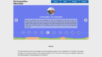
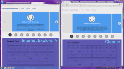
Striving for accessibility - Eval pt 1

Part 1 of my final evaluation. This entry outlines key decisions that I made regarding accessibility towards the end of the development period. I am writing and publishing it retroactively as it as represents a very large amount of thinking and work, which I kept notes about as I went along.

19 Jan, 2017

The weekend of doom
The weekend of doom

In my last entry I talked about the suggestions that Theo provided from his perspective as a nurse and researcher. They were very helpful, but lead to some rather major layout changes. In particular, the to do: “I will need more space in the carousel/timeline”. This led to what I nicknamed in my GitHub posts as the Weekend of Hell, I am softening this within the context of this journal entry to be the Weekend of Doom.

16 Jan, 2017

Accessibility and responsive bits

This journal entry represents a mammoth effort to add high-quality content to the site. I developed and added the patient story. This was based on a characteristics list which I worked through rather vigorously on the afternoon of the 25th. This is still in handwritten form, so I will link to it as a google doc later on. I have included some key references for that process below. I want to highlight the National Joint Registry (2016) data, which was particularly helpful during the process of defining the patient story. Also the specific images that I used will be cited on the portfolio site (including cc0 works; royalty-free works) as I feel it is always very important to include the provenance of images in any context, but especially when engaging in a thought process based on a fictional patient/nurse interaction.

2 Jan, 2017

Cellular concerns
Cellular concerns

I have been plugging away at the portfolio site with the primary aim of getting a semi-functional prototype version to Dr. Theo Fotis on Monday 12th of December. There is a still a huge amount of stuff to do, fix-up and streamline I will add these tasks to my Trello board. This journal entry provides a rundown of the decisions that I have this week.

11 Dec, 2016

Progress on the grid and layout

This week I completed some major fix-up on my grid. Remember when I thought that it was almost fixed? Well I was wrong. In fact I ended up recalculating the whole thing and basing it on a single column being 65px or 6.5% in width. Happily it is now working exactly as I need it to (Mozilla Developer Network saved the day againhttps://developer.mozilla.org/en-US/docs/Learn/CSS/CSS_layout/Grids#Creating_a_fluid_grid - I am going to up my donation this year).

8 Dec, 2016

Timeline tool identified

After a lot of consideration, struggle and annoyance I finally gave in and decided to use a pre-existing tool for the timeline section of my front page. I looked a few different contenders in this final pass. Essentially, I came to the realisation that I would not be able to learn the requisite Javascript in order to build something sophisticated enough from scratch. I did a bit of trying out in this jsFiddle project, but kept running into deadends (this project is in a partially built state - so please do not judge me - the javascript is largely erased by this point): https://jsfiddle.net/43gg6x3v/7/ Initially I found only jQuery examples - but as I have previously stated, I really wanted to work with Vanilla Javascript, due to load times, future proofing the code content. I also feel that it will be more beneficial to my learning to stick to learning Vanilla Javascript (or rather Ecmascript 6) so that I truly get the language prior to becoming too invested in specific frameworks. Also having looked at these two resources: jQuery vs. Javascript gist and then the From jQuery to Javascript: A Reference - vanilla makes much more sense to me.

25 Nov, 2016

Building the grid
Building the grid

After starting my initial experiments/prototypes for the portfolio project from a boilerplate I decided that I wanted to build my own responsive CSS grid from scratch. The grid turned out fairly well although there are some very slight issues with the column alignment which I need to sort out. I also still need to add the mobile device break points. I did find it very helpful to make use of the CSS calc() function to actively resize widths in percentages based on window size (calc()., 2016). This is a fantastic function although the support for it isn’t universal yet (82.73 according to caniuse.com). Having said that I did try my grid in Safari to see how it behaved in an unsupported browser and I was pleased with how well it resized.

22 Nov, 2016

Wireframes 2+
Wireframes 2+

This post displays iterations of wireframe 2. In this wireframe, I took ideas from wireframes 0 and 1, but removed the next buttons in favour of a timeline at the top of the page. The top section of the page, containing the timeline, is shown as overflow (beyond the width) of the page to indicate the dynamic content. Clicking on the years, and circles on the timeline is intended to swap out the slide content and information in the centre of the timeline section. The arrow buttons on the left and right were also intended to switch between the content slides. These buttons ideally would also be operable via arrow keys on the keyboard.

20 Nov, 2016

Wireframe 1
Wireframe 1

This post shows the second iteration of the initial wireframe. This version is slightly higher fidelity and is still based on the idea that users would make use of the smooth scroll “next” buttons to transition from section to section. Navigating the information in chronological order.

18 Nov, 2016

Wireframe 0
Wireframe 0

This post shows the initial low fidelity wireframe that I created after meeting with Dr. Theo Fotis on 16/11/16. I decided on a 12 column layout due to the need to have different formats in each section. It seemed to offer a high degree of flexibility.

18 Nov, 2016