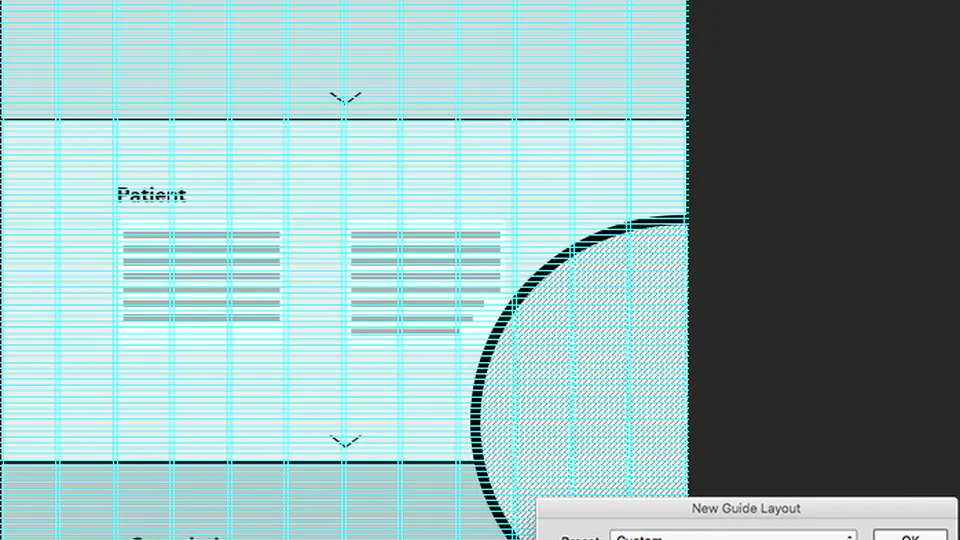
Wireframe 0
This post shows the initial low fidelity wireframe that I created after meeting with Dr. Theo Fotis on 16/11/16. I decided on a 12 column layout due to the need to have different formats in each section. It seemed to offer a high degree of flexibility.
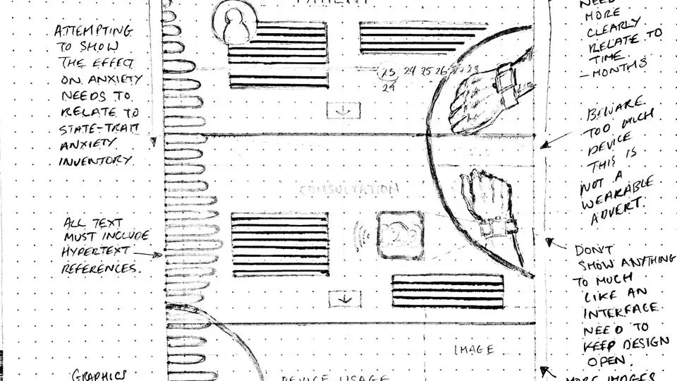
Wireframing sketches
Initial wireframe sketch. Click on “Continue Reading” to see a larger version of this image.
Business Model Canvas and more tweaks
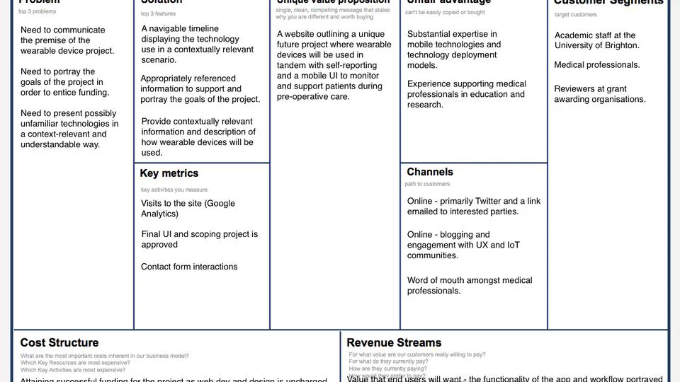
Download the PDF version of the Business Canvas Business Model Canvas (http://www.businessmodelcanvas.com), licensed under Creative Commons Attribution-Share Alike 3.0 Unported licenses (http://creativecommons.org/licenses/by-sa/3.0/). A shorter journal entry for today. I am going to provide a brief outline of what I have been working on, as I need to crack on with planning materials and more development work this week.
Portfolio site concept and other news
Over the past three weeks since the start of the module, I have been working away on the development of my portfolio site concept and gaining domain knowledge to support the development process. I have found myself in a situation where I have been torn between completing the UX procedures and design artefacts that I learned about and implemented during previous modules and starting to code. It is like standing at the edge of an exciting, and slightly daunting, precipice wondering whether to make the leap. The good news is, I am close. I must also at this point, state that I aim to make a real and useful website. It will be short and sweet but it will, hypothetically at least, fulfill a real-world purpose. I also hope that it will be possible to use the site to support future research work that I plan to undertake.
Theme testing
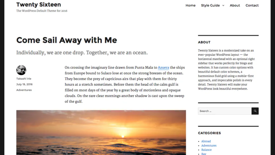
This journal entry continues on from the section, “First thoughts related to this journal site” in my first post. In that section I outlined plans to test a number of WordPress themes that had been tagged with accessibility. This led me down a fascinating path of learning with one wrong turn along the way.
![[Talk] Factors of Trust in IoT App Interfaces Redux](/post/2016/06/trust-in-iot-app-interfaces-redux/featured_hu4098621232121751635.webp)
[Talk] Factors of Trust in IoT App Interfaces Redux
Talk presented at UX Camp Brighton 2016 - Redux on 14/06/16 at 68 Middle Street http://uxbrighton.org.uk/ See original blog post for the version of this talk given at UX Camp Brighton, 2016 (19/03/16). Video version of original talk.FACTORS OF TRUST IN IOT APP INTERFACES from Fiona MacNeill on Vimeo.
Capturing live drawing in the digital age
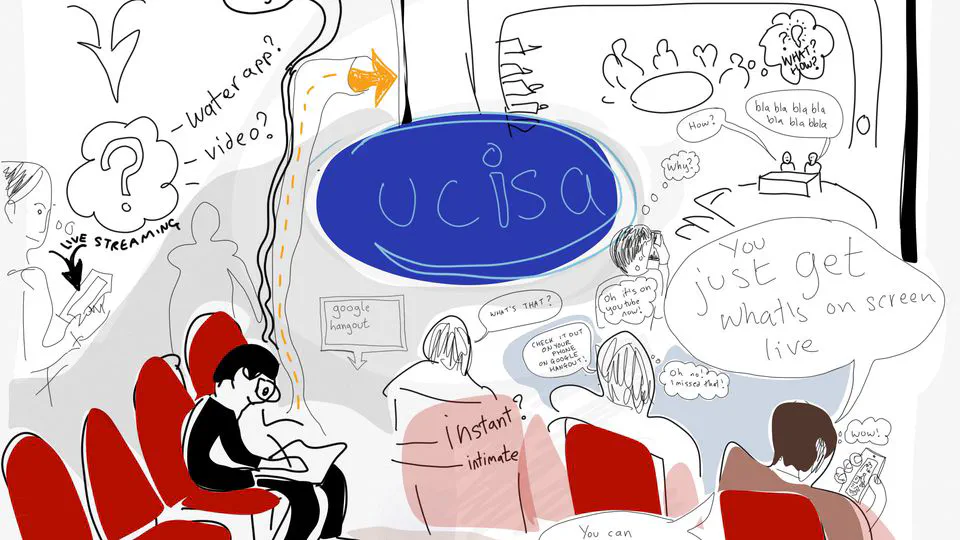
Test memo comic strip for the Spotlight on Digital Capabilities event in May. With thanks @fmacneill#udigcap@ucisapic.twitter.com/nhmYOoZ6ip [caption id="attachment_602" align="alignnone" width="1024"] Eve Turner-Lee's fantastic comic strip recounting our investigation.[/caption] — Eve Turner-Lee (@eturnerlee) 30 March 2016 I am helping to organise a conference later on this month as part of my work on the UCISA Digital Capabilities group. The event is called the Spotlight on Digital Capabilities (May 25/26) and just to let you know, if you find this post particularly riveting there are still spots to attend! You may also recall my guest post on the Rise blog about the gamification of last year’s UCISA conference (as well as my frantic live blogging during the event).
![[Talk] Factors of Trust in IoT App Interfaces](/post/2016/03/talk-factors-of-trust-in-iot-app-interfaces/featured_hu4098621232121751635.webp)
[Talk] Factors of Trust in IoT App Interfaces
Talk presented at UX Camp Brighton on 19/03/16 http://www.uxcampbrighton.org/sessions/ FACTORS OF TRUST IN IOT APP INTERFACES from Fiona MacNeill on Vimeo. Trust definitions used in this video are from Pavlidis, Islam, Mouratidis, and Kearney (2014).
![[Talk] Gamification in Higher Education](/post/2016/03/gamification-in-higher-education/featured_hu14092077681823904716.webp)
[Talk] Gamification in Higher Education
References and resources Games and Gamification for Learning and eLearning Talk given at the Brighton Gamification Meetup on the 9th of March, 2016. http://www.meetup.com/Brighton-Gamification-Meetup/events/226393358/ Slide 1
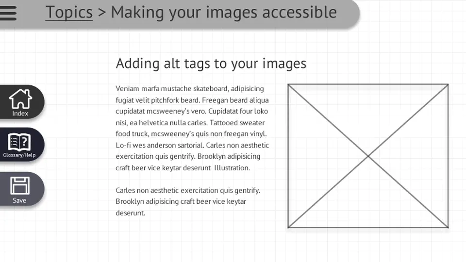
Wireframes: Are friends electric
The title of this blog post is a nod in the direction of Mr. Gary Numan. It felt like the right time to get some simple mock-ups ready in Adobe Fireworks; thus we became electric and moved away from paper, but only temporarily as this will speedup some of the low-fi paper prototypes that I plan later on. Fireworks seemed like the best choice as it is javascript-centric and I think that in all likelihood the final product would be coded in Bootstrap JS (but that would be up to my hypothetical developer). This is going to be a very long journal entry as there were a lot of decisions involved in taking the jump to the new format. Bear with me. So first on my list, although I did it second (as I ’think’ in colour) was to create a flexible frame-based mock-up of a topic page where learning content would be delivered. The frame size is set to 805 X 604 as this is the size of the window typically specified by Xerte, the University of Nottingham’s Learning Object creation tool. The specific Xerte example that I drew inspiration from can be found at the following link: http://www.nottingham.ac.uk/toolkits/play_8203. You will see that my progression buttons at the bottom of the page bears some resemblance to theirs, as I felt that it was an elegant solution to the problem in both a browser window and on a mobile device. I would be sure to cite this in my final code! However, I do think that a bit of polishing is needed and possibly an alternative for testing purposes; I think that the “2 / 4” looks like a button too, which could lead to confusion, so that is something to fix.